Hoe maak je een diagram met datum en tijd op de X-as in Excel?
In Excel voegen we vaak een diagram in om gegevens beter te beschrijven. Maar in sommige gevallen, wanneer je een kolom-/staaf-/lijndiagram maakt op basis van een reeks datums en tijden, kan de X-as van het diagram eruitzien zoals in de onderstaande schermafbeelding. In dit artikel introduceer ik de methode om datum en tijd correct weer te geven op de X-as in het Diagram.

Maak een diagram met datum en tijd correct op de X-as
 Maak een diagram met datum en tijd correct op de X-as
Om de datum en tijd correct weer te geven, hoeft u slechts één optie te wijzigen in het dialoogvenster As Opmaak.
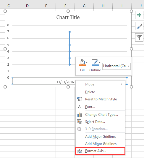
1. Klik met de rechtermuisknop op de X-as in het diagram en selecteer As Opmaak in het contextmenu. Zie schermafbeelding:
2. Vervolgens in het As Opmaak paneel of As Opmaak dialoogvenster, onder het tabblad As Opties vink aan Tekstas optie in de sectie As Type Zie schermafbeelding:
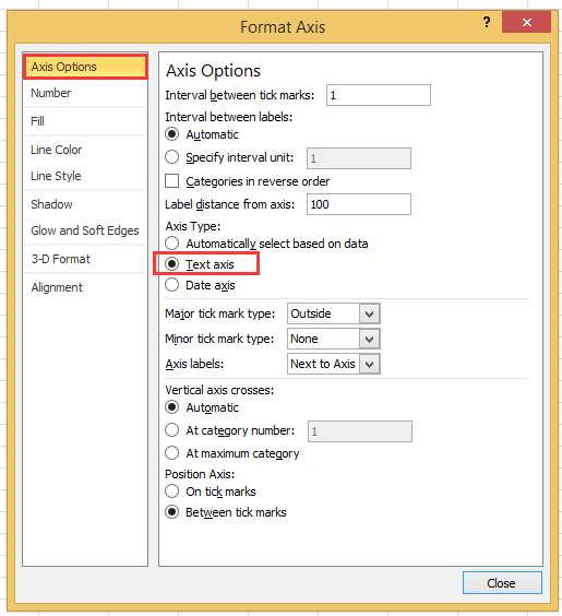
Als u een Excel-versie later dan 2010 gebruikt, ziet u een As Opmaak-paneel verschijnen, waar u de Tekstas-optie kunt aanvinken onder As Type in de groep As Opties.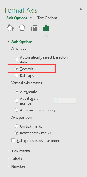
3. Klik op Sluiten of ga terug naar het diagram, dan worden de datum- en tijdgegevens correct weergegeven op de X-as. Zie schermafbeelding:

Maak een Snelheidsmeterdiagram in slechts twee stappen! |
| Als u een snelheidsmeterdiagram wilt gebruiken om projectvoortgang te tonen, kan het maken ervan in Excel complex en tijdrovend zijn. Het Snelheidsmeterdiagram-hulpprogramma in Kutools voor Excel vereenvoudigt dit proces, waardoor u in slechts twee eenvoudige stappen een professioneel snelheidsmeterdiagram kunt maken. Download Nu!. |
 |
Beste productiviteitstools voor Office
Verbeter je Excel-vaardigheden met Kutools voor Excel en ervaar ongeëvenaarde efficiëntie. Kutools voor Excel biedt meer dan300 geavanceerde functies om je productiviteit te verhogen en tijd te besparen. Klik hier om de functie te kiezen die je het meest nodig hebt...
Office Tab brengt een tabbladinterface naar Office en maakt je werk veel eenvoudiger
- Activeer tabbladbewerking en -lezen in Word, Excel, PowerPoint, Publisher, Access, Visio en Project.
- Open en maak meerdere documenten in nieuwe tabbladen van hetzelfde venster, in plaats van in nieuwe vensters.
- Verhoog je productiviteit met50% en bespaar dagelijks honderden muisklikken!
Alle Kutools-invoegtoepassingen. Eén installatieprogramma
Kutools for Office-suite bundelt invoegtoepassingen voor Excel, Word, Outlook & PowerPoint plus Office Tab Pro, ideaal voor teams die werken met Office-toepassingen.
- Alles-in-één suite — invoegtoepassingen voor Excel, Word, Outlook & PowerPoint + Office Tab Pro
- Eén installatieprogramma, één licentie — in enkele minuten geïnstalleerd (MSI-ready)
- Werkt beter samen — gestroomlijnde productiviteit over meerdere Office-toepassingen
- 30 dagen volledige proef — geen registratie, geen creditcard nodig
- Beste prijs — bespaar ten opzichte van losse aanschaf van invoegtoepassingen